“Don’t push my buttons—unless they’re in the right place!”
It’s surprising how something as small as button placement can significantly influence your website’s user experience. In web design, the devil is indeed in the details. While striking visuals and sleek layouts may initially grab a visitor’s attention, it’s often the smaller, overlooked design elements—like the location of that button, the readability of your fonts, or even the colors you choose—that truly shape the user experience (UX). These minor decisions can drastically impact whether a customer chooses to stay on your site or leave.
In this article, we’ll explore how these subtle design choices can either enhance or hinder the user experience on your website. Additionally, we’ll highlight how Fogofy Ltd’s meticulous attention to detail ensures that every design element is optimized, helping your business convert visitors into loyal customers.
The Power of Small Design Details: Why They Matter
When it comes to web design, it’s easy to be mesmerized by big picture elements—like an eye-catching homepage, a memorable logo, or a stunning interactive feature. However, the reality is that the user experience is largely influenced by smaller details. How intuitive is your website’s navigation? Can visitors quickly find what they’re looking for? Does your site effectively guide them toward taking action?
These small design elements can significantly affect whether users remain on your site or leave, and whether they complete desirable actions—such as signing up for a newsletter, making a purchase, or filling out a contact form.
Let’s take a closer look at some of these small but impactful elements and how they can make or break your website’s user experience.

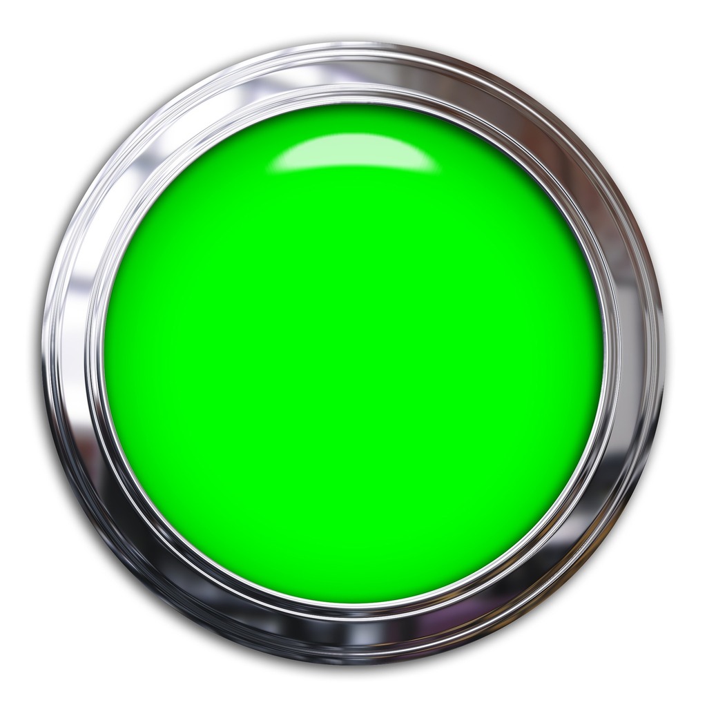
Button Placement: Leading Users to Action
You might consider buttons to be functional elements, but their placement and design can dramatically influence a user’s overall journey. Picture a beautifully designed website with a prominent call-to-action (CTA) button, but it’s hidden at the bottom of the page, out of sight after a lengthy scroll. Most users might never find it!
Strategic Button Placement
The position of your CTA buttons is crucial for driving conversions. They should be placed in logical, easy-to-find spots, such as near the top of the page or in areas where users are likely to act. This is where Fogofy Ltd excels—creating a user flow that intuitively guides visitors to the next steps, ensuring that your CTA buttons are always accessible.
Button Design and Text Matter Too
It’s not just about where the button is; it’s also about how it looks and what it communicates. A well-designed button should stand out while seamlessly blending with your website’s overall aesthetic. The text on the button should be clear, concise, and action-oriented. At Fogofy, we focus on crafting buttons with visual appeal and user intent in mind, encouraging visitors to take action.
Font Choices: Readability vs. Style
Choosing fancy or decorative fonts may be tempting, but if visitors struggle to read your content, you’re compromising their experience. Fonts are a significant component of user experience, particularly in terms of readability and accessibility.
Readability First
While stylish fonts can add flair, they should never detract from legibility. Overly decorative fonts for body text can frustrate users, especially on mobile devices. Fogofy Ltd prioritizes font selections that are easy to read across all screen sizes, ensuring that your content remains accessible to every visitor.
The Psychology of Fonts
Fonts also carry psychological weight. Serif fonts, known for their little “feet,” can evoke tradition and trustworthiness, while sans-serif fonts tend to feel modern and clean. Fogofy understands the impact of font psychology, helping you choose the right typefaces to reflect your brand’s personality and desired impression.
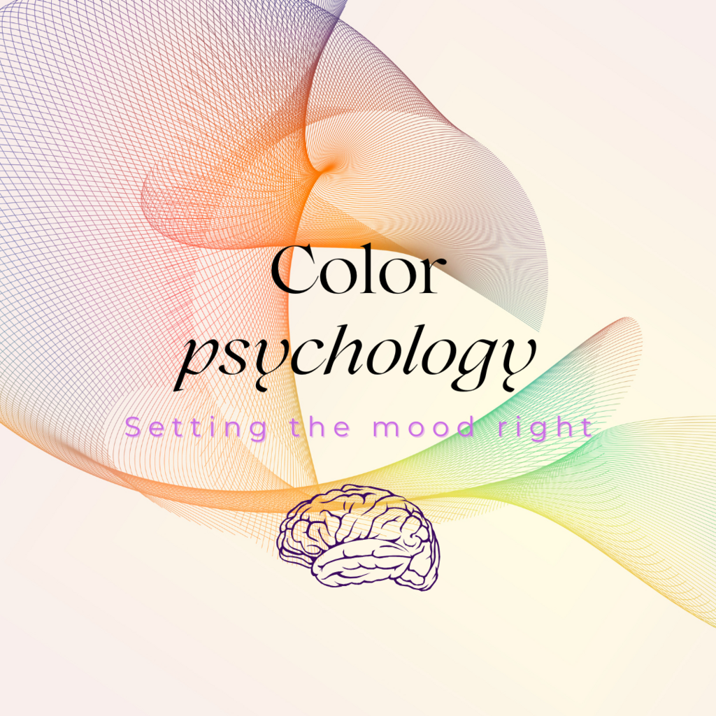
Color Psychology: Setting the Right Mood
While color decisions may appear aesthetic, they are among the most powerful tools in web design. Different colors evoke varying emotions, and utilizing the right combinations can subtly guide user behavior.
Colors That Influence Behavior
For instance, red is associated with urgency, prompting immediate action, while blue conveys trust and calm, making it suitable for brands seeking reliability. At Fogofy Ltd, we evaluate the psychological impact of color choices to ensure your website not only looks appealing but also elicits the right emotional response from visitors.
Consistency Is Key
One of the most vital aspects of color in web design is consistency. Fogofy ensures that your color scheme remains cohesive across your website, digital ads, and social media platforms, creating a unified brand experience. This consistency enhances visual appeal and reinforces brand recognition, keeping your business prominent in the minds of users.
Whitespace: Letting Your Design Breathe
Whitespaces—the empty areas between elements—are often underestimated. Many might believe that cramming every inch of the screen with information engages users, but an overly cluttered site can overwhelm visitors and hinder navigation.
The Balance Between Content and Clarity
Whitespace provides your content with room to breathe, facilitating user focus on what’s important. It creates a more relaxing and enjoyable browsing experience, increasing the likelihood that users will remain on your site longer and engage more deeply with the content. Fogofy’s design philosophy emphasizes a careful balance between content and whitespace, ensuring your site feels clean, modern, and user-friendly.
Navigation Menus: Clear and Intuitive
When users arrive at your site, they should easily locate what they’re seeking. Cluttered or confusing navigation menus can frustrate visitors, leading them to abandon your site prematurely.
Simple and Effective Menus
At Fogofy Ltd, we design navigation menus with simplicity and clarity in mind. We create intuitive structures that allow users to explore your site without feeling lost. Whether it’s a drop-down menu or a fixed navigation bar, we ensure it’s user-friendly and accessible on all devices, providing a seamless browsing experience.
Images and Media: Optimized for Performance
Stunning imagery can enhance your website’s design, but unoptimized images can slow down your site’s performance, negatively affecting user experience and search rankings.
Balancing Beauty and Speed
Fogofy Ltd guarantees that all images and media are optimized for fast loading times without sacrificing quality. We find the perfect balance between captivating visuals and performance, ensuring your site looks fantastic and operates smoothly while keeping visitors engaged and improving your SEO ranking.
Mobile Optimization: Small Screens, Big Impact
With more users accessing websites via mobile devices than ever before, mobile optimization has transitioned from optional to essential. However, optimizing for mobile isn’t merely about resizing your desktop site for smaller screens; it requires rethinking the user experience as a whole.

Designed for Touchscreens
From larger, easily tappable buttons to reorganized layouts that enhance content readability, Fogofy Ltd ensures that every aspect of your website is optimized for mobile. We understand the distinct needs of mobile users, designing with those needs in mind to create a seamless and frustration-free mobile experience.
Microinteractions: Small Touches, Big Engagement
Microinteractions are tiny animations or responses that users experience when interacting with your site—for example, a button changing color when hovered over, or a subtle sound when a form is submitted. While these details may seem minor, they play a crucial role in enhancing user experience.
Adding Delight to the Experience
Microinteractions introduce a layer of interactivity that makes your site feel more dynamic and responsive. At Fogofy, we enjoy integrating these small touches to make your website feel alive and engaging, increasing user satisfaction and the time they spend on your site.

Conclusion: Fogofy Ltd—Your Partner in Perfecting the Details
In web design, it’s the minor details that have the greatest impact on user experience. From button placement and font choices to color psychology and whitespace, every element contributes to users’ interactions with your site. At Fogofy Ltd, we recognize that no detail is too small to overlook. Our dedicated team designs websites that not only look stunning but are optimized for user experience, helping you convert more visitors into loyal customers.
Whether you’re launching a new site or enhancing an existing design, Fogofy Ltd has the expertise to make sure every element works together seamlessly, creating an enjoyable, conversion-driven user experience.
FAQs
Why are micro interactions important in web design?
Micro interactions contribute to a level of interactivity that boosts user engagement and satisfaction, making the website feel more responsive and dynamic.
Why is button placement so important for user experience?
Button placement guides users toward taking actions, such as making a purchase or signing up for a service. Poor placement can lead to missed opportunities and lost conversions.
How does font choice impact website usability?
Font choice affects readability and accessibility. Fonts that are difficult to read can frustrate users, while well-selected fonts improve user experience and effectively communicate your message.
What role does color psychology play in web design?
Colors evoke emotions and influence behavior. The right colors can guide users toward desired actions, while inappropriate colors may confuse or repel them.
How does whitespace improve user experience?
Whitespace enhances readability and prevents your site from appearing cluttered. It allows users to concentrate on significant elements and improves overall clarity.